TABLEAU DONUT CHART:
Many People Doest know how to create a basic donut chart in front of clients.
I would suggest you simple steps with my knowledge on tableau.
i have Searched many website regarding donut chart every thing is complex and making no sense for beginners
You refer this blog and give try :)
Create a basic Pie chart as shown in bellow figure
How to create a Basic pie chart
Use pie charts to show proportions of a whole.
The basic building blocks for a pie chart are as follows:
Mark type:
|
Pie
|
Color:
| Dimension |
Angle:
|
Measure
|
To create a pie chart view that shows how different product categories contribute to total sales, follow these steps:
- Connect to the Sample - Superstore data source.
- Drag the Sales measure to Columns.Tableau aggregates the measure as a sum.
- Drag the Sub-Category dimension to Rows.The default chart type is a bar chart.
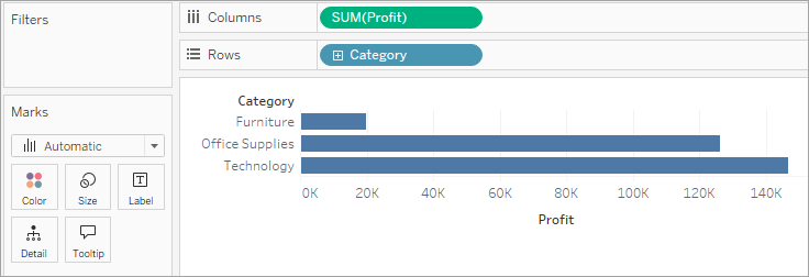
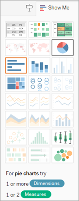
- Click Show Me on the toolbar, then select the pie chart type.
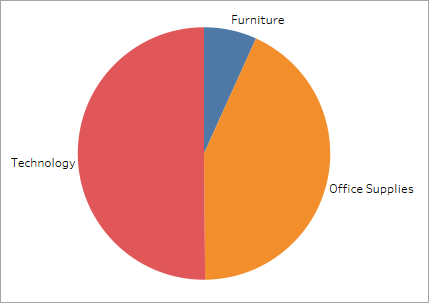
 The result is a rather small pie:
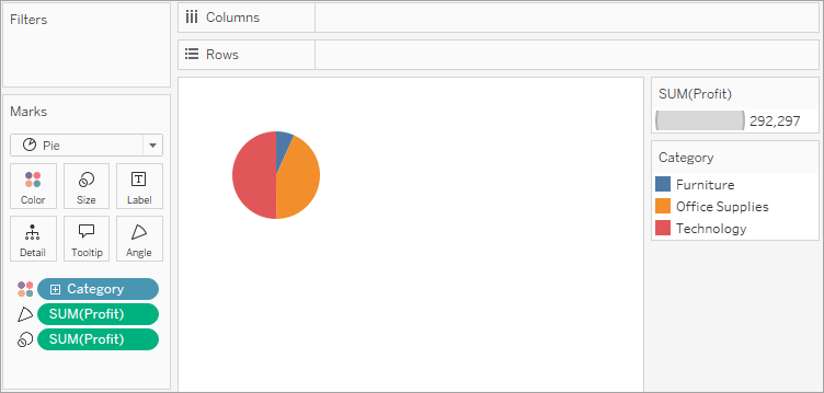
- To make the chart bigger, hold down Ctrl + Shift (hold down ñ + z on a Mac) and press B several times.
- To add labels, drag the Sub-Category dimension from the Data pane to Label on the Marks card.
- If you don't see labels, press Ctrl + Shift + B (press ñ + z + B on a Mac) to make sure most of the individual labels are visible.
You can make a pie chart interactive in a dashboard. For more information, see Actions and Dashboards.
Note: Pie charts can also be used as a mark type in a visualization. For more information, see Pie mark.
Check your work! Watch steps 1-7 below:

Donut Chart:
Now leave the Pie Chart and create dual AVG(0) in rows column
Like Avg(0) Avg(0)
Step 1: Create Two Aggregate Measure Fields
We will start by creating two aggregate measure fields in the Rows section. In this section, we double-click and write avg(0) then click enter.
Similarly, we enter another aggregate measure.
Step 2: Select Mark Type for Measures
Next, we select the mark type for the first measure as Pie from the Marks list. Also, note that by creating two aggregate measures, we have two sections for each measure in the Marks card. We will use these two sections for both measures discreetly to create our Tableau donut chart.
Step 3: Add Set of Fields to Get Pie Chart
Now, we will add a set of fields in Color, Angle, and Label cards of the Marks section. Please note that we are adding these fields in the first AGG(avg(0)) field column. By adding these fields in the appropriate columns, we get a pie chart as seen in the screenshot below, with three sections, name labels, and value labels.
We apply a Quick Table Calculation to our SUM(Sales) field by right-clicking on it, selecting the option Quick Table Calculation and then selecting Percent of Total. This will show the percent of the total sales for each category in the labels of the chart.
Step 4: Select Circle from Drop-Down List
Next, we right-click on our second measure field (i.e. AGG(avg(0))) in the Marks section and select Circle as the mark type from the drop-down list.
Step 5: Select Color Card to Change Circle Color
We change the color of the circle from grey to white. To do this, click on the Color card and select white from the given color palette. Again, make sure that you are performing this step for the second measure field.
Step 6: Add Measure Field into Label Card
Look closely, our last step creates a white circle on the lower half of the plot area. Before we go ahead, we add a measure field, Sales into the Label card of the second aggregate measure section. This adds a value showing total sales for all three categories below the white circle.
Step 7: Select Dual Axis to Combine Charts
Now, it’s time to combine these two charts and get a step closer to our final tableau donut chart. To do this, right-click on a measure field name present in the Rows section and select Dual Axis from the drop-down menu.
Step 8: Click on Size Card to Reduce Size
Right now, all we see is a white circle, with data labels around it. It is because the two charts completely overlap each other. To bring the second chart in the front, click on the Size card and reduce the size of the white circle.
Step 9: Finalise Tableau Donut Chart
Once we adjust the size of the inner white circle, we could see a donut-shaped chart having three sections and data labels. In the center of the donut chart, we have the total sales value for all the three categories.
Step 10: Change the Color Scheme of the Chart
We can also change the color scheme of the chart by clicking on the Color card in the first measure field section.


Comments
Post a Comment